SOS homophobie
A digital overhaul to strengthen associative engagement
SOS homophobie
The struggle redefined
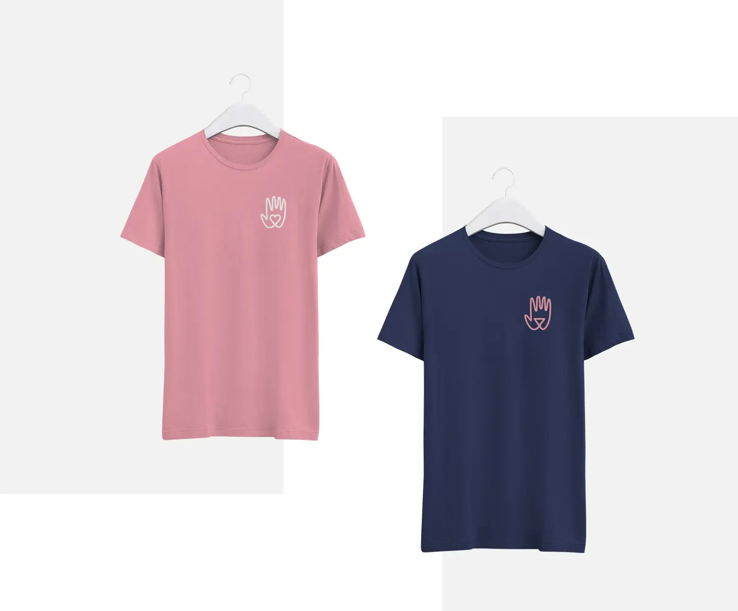
The new identity has been designed to convey a more humane notion of struggle, based on solidarity and gathering. In this perspective, a visually recognizable and reproducible element, in the vein of the graphic codes of the social movement of May 68, has been created. This element will become a symbol of SOS Homophobie's commitment. This identity has been designed to be modular. The logo is thus available in two versions corresponding to the activities of SOS Homophobie: on one side listening, education, solidarity, and on the other the fight, struggle, gathering.
A more human website
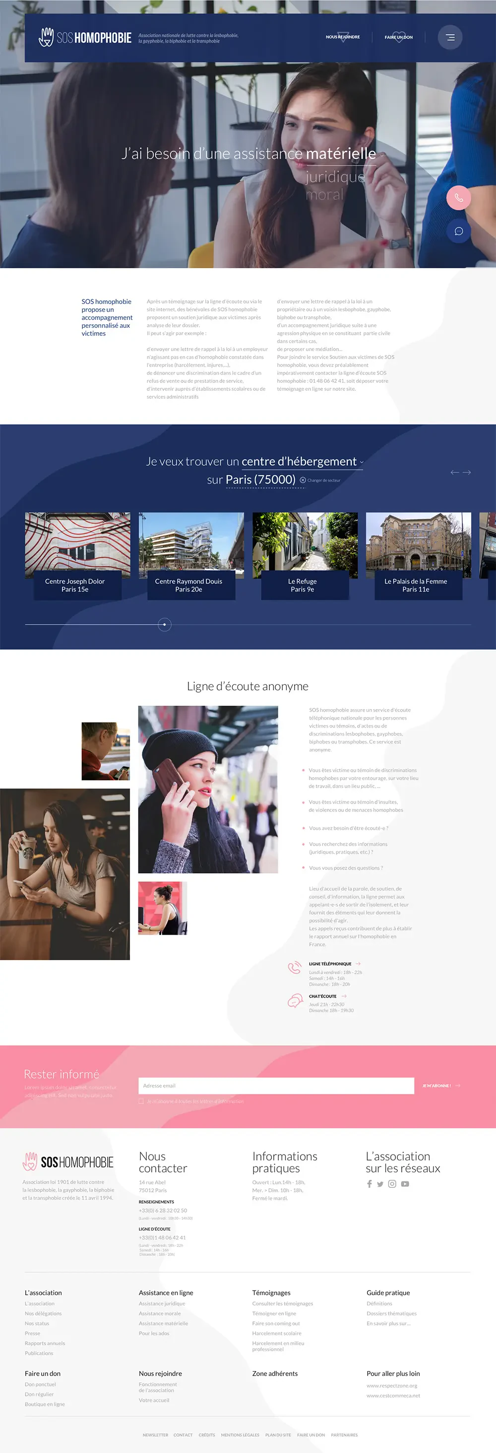
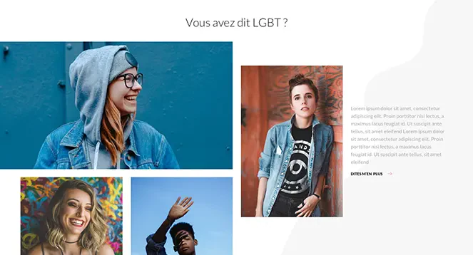
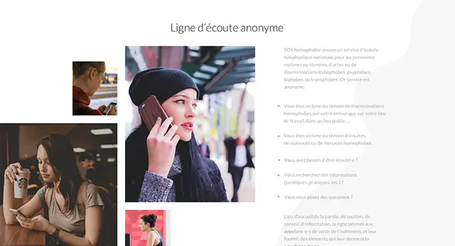
In line with the new identity, a site with a more educational, preventive, and didactic purpose is being established. This site is designed as a portal, with a clear editorial line. Informative content is thus created, testimonies are highlighted, the content is humanized, just like the fight and the association, by extension. It is essential to show the internet user that they are not alone. Assistance to victims is emphasized and personalized, and the social dimension of the movement is propelled by testimonies and social networks.
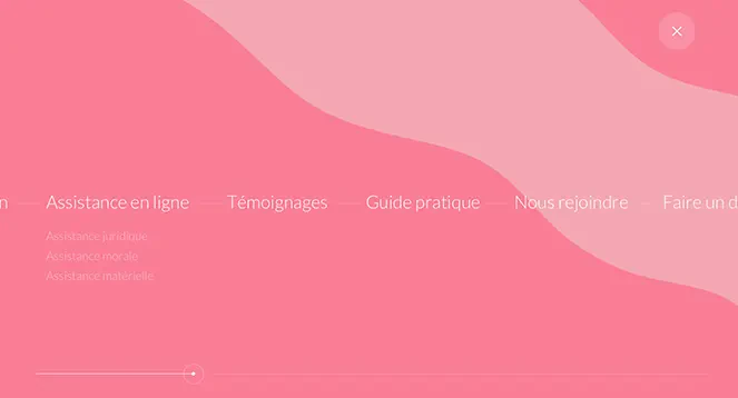
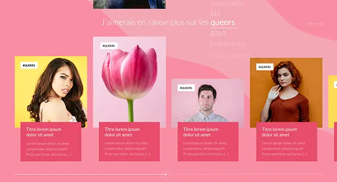
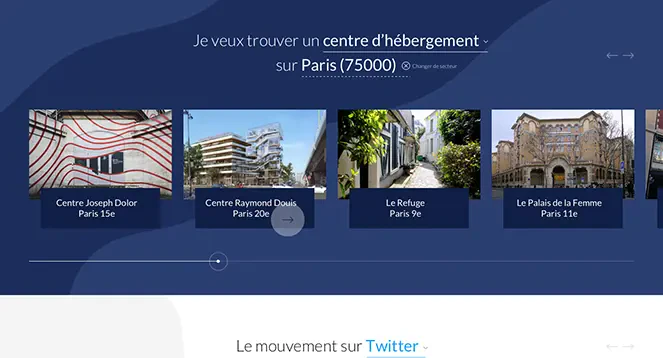
Just like the logo, the content is sorted into 2 categories, on one side, in pink, support, information, education and on the other, in blue, the fight, assistance, the actions of the association.
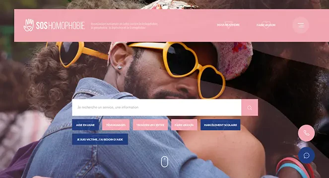
Research is highlighted as soon as you arrive on the site. Access to content is indeed a key element of the site redesign. To make the search faster and more user-friendly, frequently searched terms are displayed directly under the search engine.

